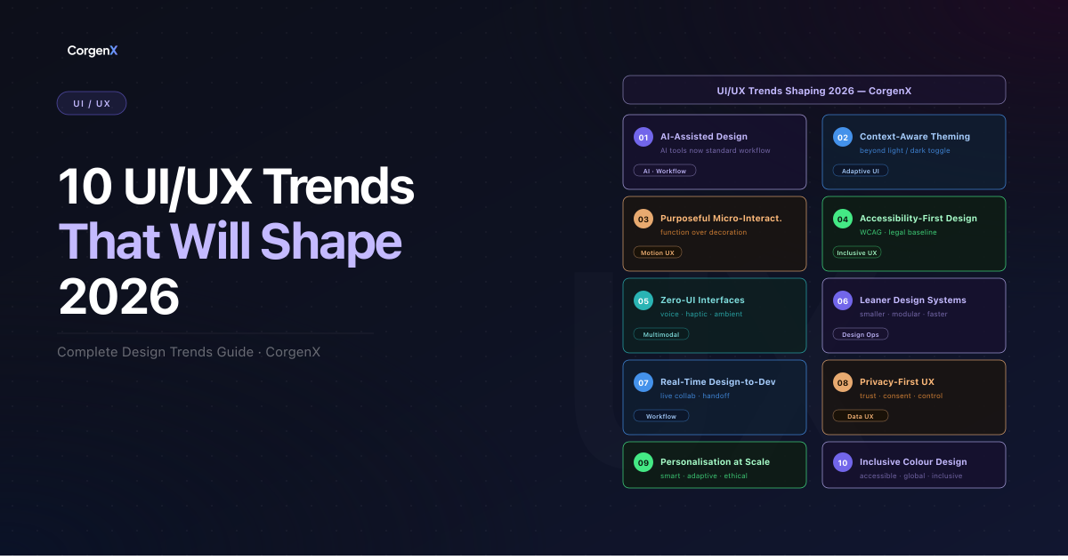
10 UI/UX Trends Reshaping Product Design in 2026
The most consequential UI/UX trends of 2026 are not aesthetic — they are structural. The convergence of AI tooling, evolving accessibility standards, shifting user expectations around privacy, and a wholesale rethinking of what an "interface" even is has produced a landscape that looks meaningfully different from even 18 months ago.
This is not a list of aesthetic micro-trends. The shifts covered here are structural — they affect how design teams are organized, how products are built, how legal compliance intersects with UX decisions, and how users experience software across every surface. Whether you are a product designer, a design manager, a PM, or a founder making decisions about your product's experience layer, these trends have direct consequences for the work you do in 2026.
In this guide, we will cover:
- How AI is reshaping the design workflow — and what that means for designer roles
- Why dark mode is evolving into something far more sophisticated
- The shift from decorative to purposeful micro-interactions
- Why accessibility has moved from compliance checklist to baseline product requirement
- The rise of zero-UI and what it demands from design teams
- How the best design systems are getting smaller, not bigger
- What real-time collaboration now looks like in design-to-dev workflows
- Why privacy has become a UX feature users actively evaluate
- How personalization at scale is arriving in core product UX
- A bonus trend on inclusive color design that most teams are still underestimating
 10 UI/UX Trends Reshaping Product Design in 2026
1. AI-Assisted Design Tools Become the Standard
Twelve months ago, AI features in design tools were a competitive differentiator. In 2026, they are table stakes. Figma, Adobe, Framer, and a growing list of specialized tools have embedded AI into the core of the design workflow — not as a sidebar feature, but as a native layer.
What has changed is not just capability — it is adoption. Design teams that previously experimented with AI-assisted tools are now building workflows that depend on them. Auto-layout suggestions, AI-generated component variants, intelligent design token recommendations, and copy generation directly within the design file are now standard expectations, not premium add-ons.
The important nuance: AI is augmenting designer productivity, not replacing designer judgment. The teams getting the most value from AI tooling are those who treat it as an accelerant — reducing time spent on mechanical tasks (resizing components, generating responsive breakpoints, writing repetitive microcopy) so that more time can be invested in the decisions that actually require human taste and user empathy.
The structural impact is significant. Design timelines have compressed. The expectation of what a small design team can produce has increased. And the skill profile of a competitive designer in 2026 includes knowing how to prompt, evaluate, and selectively use AI output — not just how to use Figma.
 Figure 1: AI is not replacing designers — it is becoming their most capable collaborator. The teams winning in 2026 are the ones who have learned to work with it, not around it.
2. Dark Mode Evolves Into Context-Aware Theming
Dark mode as a binary toggle is now the 2019 version of this conversation. In 2026, the leading products have moved past "light or dark" into context-aware theming — interfaces that adapt based on time of day, ambient light conditions (via device sensors), user-defined schedules, and content type.
The practical shift looks like this: a productivity app might default to a warm, lower-contrast theme during evening hours, shift to a high-contrast, bright theme in a sunlit environment, and offer a reading-optimized mode when the user switches to long-form content. These are not manual selections — they happen automatically, based on context signals the device already has access to.
Why this matters beyond aesthetics: Context-aware theming is where personalization meets accessibility. A well-implemented adaptive theme is not just a preference feature — it is a functional improvement for users with light sensitivity, migraines, or situational impairments (bright outdoor environments being a common one). The teams building context-aware theming are solving a real usability problem, not chasing a trend.
The technical challenge is non-trivial. Implementing consistent theming across a complex component library — one that holds across responsive breakpoints, third-party embeds, and user-generated content — requires a disciplined design token architecture. Teams that invested in semantic token systems early are now in a position to implement this. Teams that did not are rebuilding.
 Figure 2: Modern dark mode is not a toggle; it is a context-aware system that responds to the environment.
3. Micro-Interactions Shift From "Delightful" to "Purposeful"
For years, micro-interactions were evaluated on a single axis: delight. Did the button feel satisfying to press? Did the loading animation reduce perceived wait time? Was the hover state "on-brand"? In 2026, that framing has largely been retired in favor of a more rigorous question: does this interaction reduce cognitive load or increase it?
The shift is being driven by two forces. First, performance budgets are tighter — animation that is not functionally justified is increasingly treated as technical debt, not creative investment. Second, product teams have better instrumentation. Interaction analytics tools can now surface whether specific animations are correlated with faster task completion, higher error rates, or increased engagement. The data is forcing a more honest evaluation of what animations are actually doing.
Purposeful micro-interactions serve a specific function: they confirm an action was registered, indicate system status, guide attention to the next step, or prevent errors before they happen. Wasteful micro-interactions add time, distract focus, or create visual noise that users learn to ignore.
The practical test: For every animation in your product, ask — if this interaction were removed, would the user lose meaningful information or feedback? If the answer is no, the animation is probably decorative, not functional. That is not always wrong, but it should be a deliberate choice with a justified aesthetic rationale, not a default.
4. Accessibility-First Design Becomes Non-Negotiable
WCAG compliance has been the "right thing to do" for a long time. In 2026, it has become something additional: a legal expectation, a procurement requirement, and in an increasing number of markets, a regulatory baseline with enforcement teeth. The EU Accessibility Act came into full effect for digital products in June 2025. Similar frameworks are maturing across North America and APAC. Product teams that treated accessibility as a retrofit exercise are now confronting the cost of that decision.
The business case is clear: Accessible products serve a broader audience, perform better in assistive technology ecosystems, and generate fewer support escalations around usability edge cases. Inclusive design — designing for the full range of human variation in ability, context, and device — consistently produces better products for everyone. The curb-cut effect is real: features designed for users with disabilities routinely improve the experience for all users.
Common accessibility mistakes that product managers should be watching for:
- Color contrast ratios that fail WCAG AA standards at the component level, not just the page level
- Interactive elements without keyboard navigation support
- Images and icons lacking meaningful alt text
- Forms without visible, persistent error states
- Focus indicators removed or suppressed for aesthetic reasons
The shift in 2026 is that accessibility is entering the design brief, not the QA checklist. Teams that start with accessibility constraints — rather than retrofitting for them — are producing better designs with less rework.
 Figure 3: Accessibility has moved from a retrofit requirement to a foundational design primitive for every surface.
5. Zero-UI and Invisible Interfaces Gain Traction
The most significant interface of 2026 may be the one you cannot see. Zero-UI — the design of interactions that happen without a traditional visual screen — is moving from niche to mainstream, driven by the accelerating adoption of wearables, IoT devices, smart home ecosystems, and voice-native interfaces.
The design challenge is fundamental: how do you design an experience when there is no visual layer? The answer requires rethinking UX from its first principles. Interaction becomes audio feedback, haptic response, ambient signaling, and behavioral inference. The user's mental model of the system is built through pattern and response, not through navigation and visual affordance.
Use cases that are scaling in 2026: Smart home interfaces that adapt to routine without requiring explicit commands. Wearables that surface health alerts without screen interaction. Voice-first customer service flows that resolve queries without a single tap. These are not edge-case products — they are mainstream consumer experiences.
For design teams, this trend demands a new competency set. Conversation design, audio UX, haptic feedback design, and ambient computing interaction patterns are not covered by traditional UI training. The teams investing in these skills now are building a meaningful lead over teams that treat zero-UI as someone else's problem.
 Figure 4: Zero-UI demands a total rethinking of interaction, moving beyond the screen into haptic, audio, and ambient layers.
6. Design Systems Get "Lighter" (Goodbye, Feature Bloat)
The era of the monolithic design system — the single, comprehensive, thousands-of-component library that promised to govern every design decision across every product — is ending. The backlash is deserved. Over-engineered design systems became maintenance burdens that slowed teams down, created governance bottlenecks, and produced visual consistency at the cost of design agility.
The 2026 direction is modular and intentionally constrained. Leaner design systems that define core primitives — tokens, typography scales, spacing systems, core interactive components — and leave room for product-specific extension are outperforming their monolithic predecessors on every meaningful metric: adoption rate, onboarding time, contribution velocity, and designer satisfaction.
The shift in what teams measure is instructive. The best design system teams in 2026 are tracking system adoption, contribution frequency, and design-to-dev handoff speed — not component count. A design system with 400 components that engineers work around is failing. A system with 60 core components that teams actively use and contribute back to is succeeding.
If your design system has not been audited in the last 12 months, the audit almost certainly reveals components that are redundant, deprecated patterns still in active use, and a documentation layer that no longer reflects reality. Speed and maintainability are now design system success metrics.
7. Neomorphism and Soft UI: When Aesthetics Serve Function
Neomorphism — the soft, extruded, shadow-based aesthetic that emerged as a reaction to flat design — has matured considerably since its initial over-application. In 2026, it is less a trend and more a tool: a visual language that specific product categories (wellness apps, audio interfaces, premium consumer products) use selectively when it serves the brand and the user's mental model.
The more important principle: aesthetic trends matter far less than whether they serve the user's context. The designers getting this right in 2026 are asking "does this visual treatment make the interface more intuitive or less?" rather than "is this aesthetic current?" A neomorphic button that is difficult to identify as interactive is a usability failure, regardless of how on-trend it looks.
Cultural and regional variation in design preference is also increasingly relevant at scale. Design systems serving global products are building regional design flexibility into their architecture — not defaulting to a single aesthetic sensibility and treating it as universal.
8. Real-Time Collaboration in Design Tools Becomes Expected
The async-first design workflow — a designer works, exports, hands off, waits for feedback — has not disappeared, but it is no longer the default expectation on high-functioning teams. Real-time collaboration in design tools is now a baseline requirement for competitive product organizations.
Figma normalized this expectation. But the evolution in 2026 goes beyond simultaneous cursors on a design file. It extends to live design-to-dev handoff, real-time comment threading with Jira ticket linking, and design review processes that happen in the tool rather than in a separate meeting. The design-development gap is narrowing — and the tools enabling that are increasingly integrated into the same ecosystem rather than requiring context-switching.
For remote and distributed teams, this shift has been particularly consequential. The teams that built strong async design culture during the remote-first era are finding that real-time collaboration tools amplify rather than replace that foundation. The worst outcomes occur when teams adopt real-time collaboration tools without updating their workflow and decision-making processes to match.
9. Data Privacy and Security Becomes a UX Feature
Users in 2026 are not passive about data privacy. They read permission prompts. They notice when apps request access that does not match the stated function. They evaluate products — sometimes subconsciously — based on whether the privacy handling feels trustworthy. Privacy is now a product feature that users actively perceive and respond to, not just a compliance requirement that lives in the terms and conditions.
The design implication is significant. Privacy-first UX means designing consent flows that are genuinely comprehensible — not dark-pattern consent dialogs engineered to maximize opt-ins. It means surfacing data usage in context, not burying it in settings. It means giving users meaningful control over their data in interfaces that are actually navigable.
GDPR and CCPA compliance are the floor, not the ceiling. The products building loyalty in 2026 treat privacy as a brand differentiator — communicating clearly what data is collected, why it is needed, and how it is protected. Users who feel in control of their data trust the product more. Trust drives retention.
 Figure 5: Privacy is a feature. Users trust products that communicate data usage clearly and provide meaningful control.
10. Personalization at Scale Through Smart Algorithms
Dynamic interfaces that adapt to individual user behavior — surfacing the most relevant features, adjusting content density, reordering navigation based on usage patterns — are moving from experimental to expected in mature product categories. In 2026, personalization is arriving in core product UX, not just in recommendation feeds.
The design challenge is balancing personalization with predictability. Users need to be able to find things. An interface that reorganizes itself aggressively based on behavior creates anxiety and erodes trust. The best personalization implementations are ones users can feel without consciously noticing — a product that seems to understand them, not one that is visibly rearranging itself.
The ethical dimension is equally important. Personalization systems that optimize for engagement at the expense of user agency — creating filter bubbles, surfacing emotionally manipulative content, or making default behaviors increasingly difficult to change — are generating regulatory attention and user backlash. The teams building personalization responsibly are defining it in terms of user-perceived value, not internal engagement metrics.
Bonus Trend: Inclusive Color Design Goes Mainstream
Color accessibility has lived in the shadow of contrast ratio compliance for too long. In 2026, the more sophisticated conversation — one that the best design teams are already having — is about genuinely inclusive color systems that account for color blindness variation, cultural color symbolism, and the full spectrum of human color perception.
Approximately 8% of men and 0.5% of women have some form of color vision deficiency. Designing with color as the only differentiator between states, categories, or alerts excludes a meaningful portion of your audience. Inclusive color systems use color in combination with shape, pattern, label, and position — never as the sole signal.
The cultural dimension is equally underestimated for global products. Color carries different symbolic weight across cultures — a color that signals success in one market signals warning in another. Design systems serving global audiences need cultural color review as part of their localization process, not as an afterthought.
Tools like Accessible Palette, Stark, and Color Review have made inclusive color auditing faster and more integrated into the design workflow. There is no longer a meaningful productivity argument against inclusive color design — only a prioritization argument, and in 2026, that argument is losing.
Key UI/UX Trends Takeaways for 2026
- AI tools are now standard, not optional: Teams not integrating AI into their design workflow are already behind. The competitive gap will widen through 2026.
- Accessibility is a legal and product baseline: WCAG compliance is now a procurement and regulatory expectation in major markets, not just a best practice.
- Design systems should be audited for weight: Leaner, modular systems outperform monolithic ones on adoption and agility. Audit and reduce.
- Micro-interactions must earn their place: If an animation does not serve a functional purpose, it is friction, not delight.
- Privacy UX is product UX: Users evaluate products on data transparency. Design consent and control experiences with the same rigor as core flows.
- Zero-UI requires new design skills: Voice, haptic, and ambient interaction design are now core competencies, not niche specializations.
- Personalization must preserve user agency: Algorithmic personalization that removes predictability or creates filter bubbles generates backlash. Design for user-perceived value, not engagement metrics.
Start Applying These UI/UX Trends in 2026
The UI/UX trends shaping 2026 share a common thread: they are all responses to real pressure — from users demanding more control and transparency, from regulators raising the compliance floor, from AI tooling compressing timelines, and from organizations demanding design systems that actually scale. These are not aesthetic preferences or design community enthusiasm cycles. They are structural forces that will determine which products feel trustworthy, usable, and worth returning to.
The teams that will win in 2026 are the ones treating these trends not as a checklist to tick, but as a framework for asking better questions: Are we designing with accessibility from the start or retrofitting it at the end? Does our privacy UX communicate trust or obscure it? Is our design system enabling speed or creating bottlenecks? Are our micro-interactions earning their place in the interaction budget?
Every one of the trends in this guide is an opportunity to build a meaningfully better product — if your team has the intentionality to act on it. If your goal is specifically to convert more of that product traffic into leads, see our detailed guide on UX design for landing pages and lead generation — it applies several of these same trends directly to conversion architecture. And for teams investing in content alongside their product, our playbook on converting blog readers into leads covers how to connect UX decisions to pipeline outcomes.
At CorgenX, our UI/UX design team works at the intersection of these trends every day — building design systems that scale, auditing products for accessibility compliance, and helping product teams implement personalization and privacy-first UX that earns user trust. If any of these trends are exposing gaps in your current product experience, let's talk.
FAQs
Which UI/UX trend will have the biggest business impact in 2026?
Accessibility-first design has the most direct business impact in 2026 because it is now tied to legal compliance, procurement requirements, and audience reach. The EU Accessibility Act and similar regulations mean that accessibility failures carry real consequences — not just lost users, but regulatory and legal exposure. Beyond compliance, accessible products consistently perform better across a wider user base.
How are AI design tools changing the role of UX designers?
AI design tools are eliminating the most mechanical parts of the design workflow — generating component variants, resizing for breakpoints, drafting microcopy, producing initial layout options. This is compressing timelines and raising output expectations. The designer's role is shifting toward judgment, taste, and user empathy — the things AI cannot substitute. Designers who position themselves as AI-native will have a significant workflow advantage.
What is the difference between dark mode and context-aware theming?
Dark mode is a binary user toggle between two visual states. Context-aware theming is an adaptive system that adjusts the interface based on environmental signals — time of day, ambient light, content type, or user-defined schedules — often automatically, without requiring manual user selection. Context-aware theming is a superset of dark mode that treats the user's environment as an input.
How do I start building a lighter design system?
Begin with an audit: catalogue every component in your current system, identify which ones are actively used versus theoretically available, and remove or archive components with low adoption. Then define your core primitives — design tokens, typography scales, spacing systems, and interactive base components — and document them rigorously. Build product-specific extension patterns on top of the primitive layer rather than adding every edge case to the core. Measure adoption, not component count.
What does privacy-first UX actually look like in practice?
Privacy-first UX means making data handling visible, comprehensible, and controllable in the product interface itself — not buried in settings or legal documents. In practice, this includes: consent dialogs that clearly explain what is collected and why before requesting permission; in-context data usage disclosures at the point of collection; accessible data deletion and export flows; and permission requests that match the genuine functional need. The test is whether a non-technical user can understand what the product is doing with their data without legal expertise.
Related Articles
Ready to Scale?
Our high-performance web solutions and SEO strategies are designed to deliver results.
Check out our services