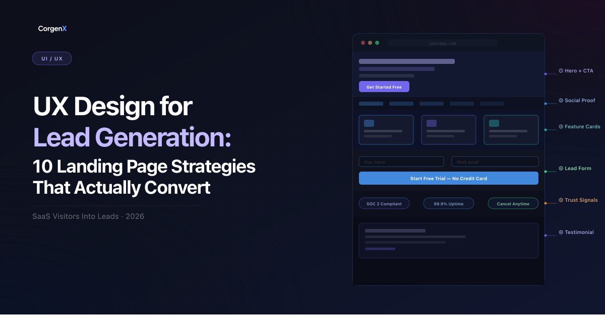
Landing Page UX Design for Lead Generation (2026)
The difference between a SaaS landing page that converts at 2% and one that converts at 12% is rarely the offer — it is the UX design decisions behind it. Every element on your landing page either reduces friction or creates it. Visual hierarchy, form structure, CTA placement, trust signals, and page speed are not aesthetic choices — they are conversion architecture decisions with measurable revenue impact.
This guide is written specifically for UX designers and product marketers building or optimizing business landing pages where lead capture is the primary goal. Whether you are designing a waitlist page for an early-stage SaaS product, a gated content download, or a demo request form, the 10 principles in this guide apply directly — and the examples are drawn from real patterns used by high-converting B2B and SaaS companies in 2026.
In this guide, we will cover:
- How visual hierarchy guides visitors to your primary CTA without cognitive overload
- The psychology of form design and why shorter forms do not always win
- How to use trust signals and social proof to convert skeptical, high-intent visitors
- CTA design principles that go beyond color psychology
- Mobile-first design that captures leads across all device contexts
- How content hierarchy and messaging architecture drive lead generation
- Why page speed is a conversion factor, not just a technical metric
- User journey mapping frameworks for landing pages
- How to build a rigorous A/B testing process for conversion improvement
- The visual design patterns that signal authority and earn trust before a word is read
 Landing Page UX Design for Lead Generation (2026)
1. Visual Hierarchy: Guiding Users to Your Primary Conversion Goal Without Cognitive Overload
Visual hierarchy is the single most powerful conversion lever on any landing page — and the most frequently misunderstood. It is not about making things look pretty. It is about engineering attention: deciding precisely where a visitor's eye travels and in what sequence so that the path to your CTA is effortless.
The human eye does not read a webpage the way it reads a book. Research on scanning behavior consistently shows that users follow F-pattern or Z-pattern eye movements, depending on layout density. They scan headlines, jump to visual anchors, and make a decision to continue or leave within three to five seconds. Your visual hierarchy must survive that three-second test.
The hierarchy framework for high-converting landing pages:
- Primary headline — Largest typographic element. States the transformation or outcome, not the feature. Must be scannable in under two seconds.
- Supporting subheadline — Smaller, supporting the claim. Adds specificity that makes the primary promise credible.
- Primary CTA — High contrast, isolated, visually dominant over all supporting content. This is your conversion goal.
- Social proof anchor — Just below or beside the CTA. Answers the implicit objection: "But should I trust this?"
- Secondary content — Features, benefits, how-it-works. Exists to serve those who did not convert immediately in sections one through four.
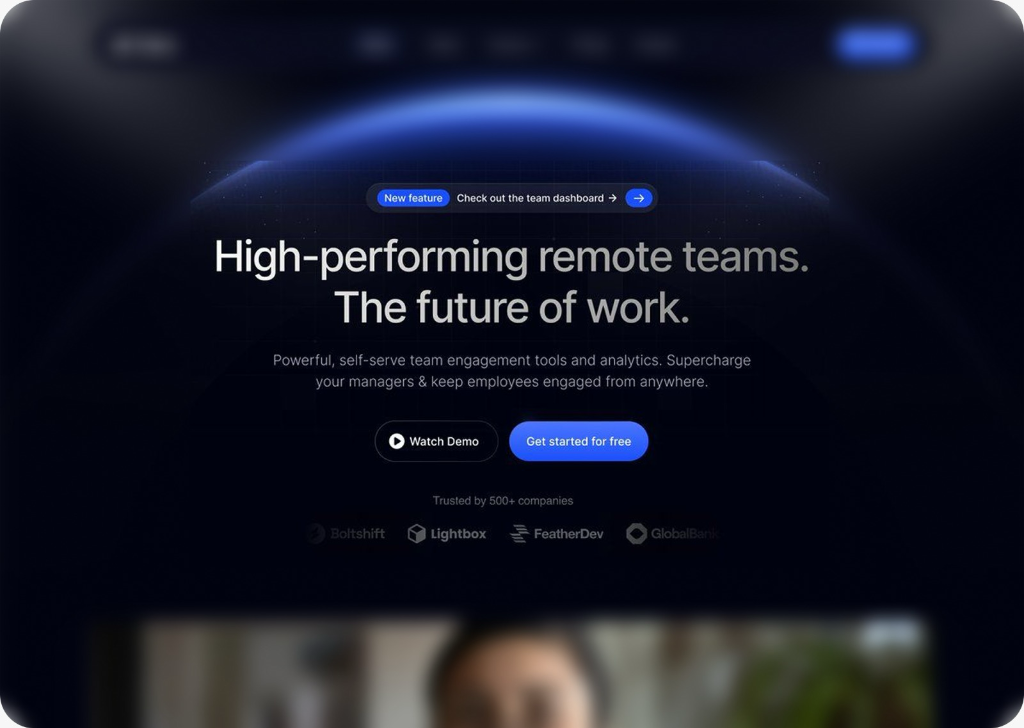
The dark navy design in Figure 1 above illustrates this precisely. The bold three-line headline dominates the visual field using large, white, heavy-weight typography against a deep background. The dramatic light flare elements on both sides create a natural visual frame that draws attention inward — toward the headline and form. The CTA button uses a high-saturation blue against the dark background, creating a contrast ratio that makes it impossible to miss. Nothing competes with it.
Common hierarchy mistakes that kill conversions:
- Equal visual weight across elements: When everything looks equally important, nothing looks important. Users are paralyzed by visual noise and default to leaving.
- CTA buried below the fold: The vast majority of visitors who convert do so without scrolling to the bottom. If your CTA only appears at the end, you are converting only your most motivated visitors — and missing everyone else.
- Navigation that competes with the CTA: Every navigation link on a landing page is a potential exit ramp. Reduce or remove navigation entirely on high-stakes lead capture pages.
- Insufficient color contrast on CTAs: A CTA that blends into your brand palette may be aesthetically cohesive but functionally invisible. Contrast is a functional requirement, not a style choice.
Use whitespace aggressively. Every pixel of empty space around your CTA increases its visual dominance. Whitespace is not wasted space — it is directed attention.
 Example of strong visual hierarchy using contrasting elements, a dark background with light flares, and a distinct primary CTA button to direct user focus.
2. The Psychology of Form Design: Reducing Friction to Capture More High-Quality Leads
Forms are where the majority of landing page conversions fail. The moment a visitor encounters a form, every extra field is a micro-decision that adds cognitive load and increases the probability of abandonment. But the relationship between form length and conversion rate is more nuanced than most designers realize.
The core tension in form design:
Shorter forms produce higher completion rates but lower-quality leads. Longer forms produce lower completion rates but higher-quality leads who self-select as genuinely interested. Your job as a UX designer is not to minimize fields — it is to match form length to the conversion context.
For a waitlist form on an early-stage SaaS product (like the "Join Waitlist" example shown in Figure 1), a single field — email only — is the correct decision. The ask is small, the commitment is low, and capturing the email is all you need at this stage. Additional fields here are friction with no justified benefit.
For a B2B demo request form, you likely need company size, role, and use case to qualify the lead before routing to sales. Reducing that form to two fields may increase completions but flood your sales team with unqualified prospects — an equally costly failure.
Form design principles that reduce abandonment without sacrificing quality:
- Single-column layouts outperform multi-column layouts. Research from Formisimo shows multi-column forms increase cognitive load and introduce parsing errors where users fill fields in the wrong sequence. Stack fields vertically.
- Use progressive profiling for returning visitors. If someone has already given you their email (from a previous touchpoint), do not ask for it again. Use marketing automation to pre-fill known fields and ask for new information incrementally across touchpoints.
- Inline validation reduces abandonment by up to 22%. Showing a green checkmark when an email format is valid (in real time, not on submit) gives users immediate positive feedback and reduces the anxiety of "did I fill this correctly?"
- Label placement matters. Labels placed above fields outperform placeholder-only labels. Placeholder text disappears when the user starts typing — the label should remain visible throughout.
- The submit button copy is microcopy. "Submit" is the worst possible label for a conversion button. It describes the user's action, not the outcome. "Get Early Access," "Join the Waitlist," "Start My Free Trial" — these describe what happens after the click, which is what the user actually cares about.
- Privacy microcopy beneath email fields increases trust. A one-line note — "No spam. Unsubscribe anytime." — directly beneath the email input field measurably reduces form abandonment in A/B tests across SaaS categories.
3. Trust Signals and Social Proof: Converting Skeptical Visitors Into Confident Leads
Every visitor who arrives on your landing page arrives with skepticism. They do not know you. They have been misled by marketing promises before. They are asking themselves — consciously or not — "Can I trust this?" Your job as a UX designer is to answer that question before they ask it, using visual elements that communicate credibility without requiring the visitor to read a word.
Trust signals fall into several categories, each addressing a different psychological objection:
Social proof (addresses: "Am I the only one considering this?")
The most powerful form of social proof on a landing page is a count of real users or customers, especially when that count is specific. The example in Figure 2 shows this executed precisely: "Already 700+ early signups from startups and creators." Three elements make this phrase convert: the specificity of "700+" (round numbers feel fabricated; specific numbers feel real), the attribution to "startups and creators" (telling the visitor exactly who their peers are), and the recency implied by "early" (creating urgency without manufactured scarcity).
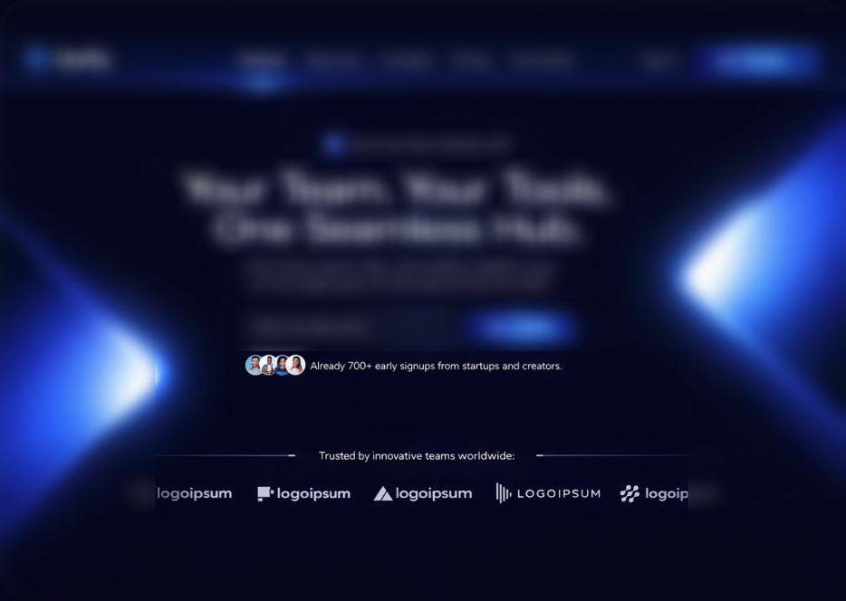 Figure 2: Effective social proof execution — stacked avatar images plus a specific signup count establish peer validation before a single testimonial is read. The logo bar reinforces authority at a glance.
The stacked avatar images beside the signup count are a deliberate design choice. Faces trigger a social response in the human brain — they are read faster and trusted more than text. Three to four real-looking user avatars beside a signup count create a visual proof cluster that communicates "real people already chose this" in under a second.
Logo bars (addresses: "Have real companies I recognize used this?")
The company logo row at the bottom of Figure 2 — labeled "Trusted by innovative teams worldwide" — works because it leverages recognition heuristics. When a visitor sees logos of companies they know, trust transfers partially to the unfamiliar brand beside them. Even placeholder logos improve conversion relative to having no logo bar, because the section itself signals that partners exist.
Design rules for trust signal placement:
- Place social proof within visual proximity of your primary CTA — not buried in a dedicated "What Our Customers Say" section three screens down.
- Use real numbers, real names, and real company names wherever possible. Anonymized testimonials ("— Marketing Director, SaaS Company") read as fabricated and reduce rather than increase trust.
- For early-stage products with limited customer proof, lead with process transparency: how the product works, what early access includes, and what happens after signup. Clarity is a trust signal.
- Security badges and privacy certifications (SOC 2, GDPR compliance) belong near email input fields, not in footers where no one looks.
4. Call-to-Action Optimization: Designing CTAs That Actually Convert
The CTA button is the most consequential single element on any landing page. Every design decision — color, size, label, placement, whitespace, shape, shadow — affects click-through rate. And yet most landing pages treat the CTA as an afterthought: a button styled to match the brand palette, labeled "Submit," placed wherever the design visually balanced.
The four dimensions of CTA optimization:
1. Copy: As discussed in the form section, your CTA label must communicate outcome, not action. Run an audit on every CTA on your existing landing pages using this filter: does the label describe what the user does or what the user gets? Every "Submit," "Click Here," or "Send" should be replaced with a specific, value-oriented phrase tied to the offer.
2. Color contrast: Your CTA button must have a contrast ratio that makes it immediately distinguishable from all surrounding elements. The "Join Waitlist" button in Figure 2 uses a saturated, mid-value blue against the dark navy background — creating a contrast ratio that exceeds WCAG AA standards while remaining on-brand. Accessibility standards are not a constraint on CTA design; they are a guide to maximum visual impact.
3. Size and whitespace: A CTA button that is too small relative to the surrounding content signals low priority. Size is a hierarchy signal — your primary CTA should be physically larger than all secondary interactive elements on the page. Surround it with whitespace. Empty space is not wasted space; it is directional pressure pointing at the button.
4. Placement hierarchy: Place your primary CTA at the point of maximum motivation — which is rarely where designers instinctively put it. For persuasive landing pages, this means placing a full CTA unit (field + button + microcopy) in the hero section above the fold, repeating it after major value propositions, and once more at the bottom of the page for visitors who read everything before deciding.
Microcopy beneath the CTA is often the highest-leverage copy on the page. A single line — "No credit card required" or "Cancel anytime" or "Join 700+ teams already on the waitlist" — can double click-through rates by neutralizing the primary objection at the moment of decision.
 Figure 3: Strategic navigation and CTA design — moving the primary conversion action to a prominent, high-contrast button in the navigation bar ensures it is always accessible while reducing visual competition from other links.
5. Mobile-First Design: Capturing Leads Across All Devices Without Sacrificing Desktop Performance
In 2026, mobile devices account for the majority of initial landing page visits across most B2B SaaS categories — even for products that users will ultimately use on desktop. This means your lead capture experience must work flawlessly on a 390px-wide screen, with a thumb as the primary input device, on a potentially slow mobile connection.
The mobile-first lead capture checklist:
- Thumb-zone optimization: Place your primary CTA within the lower-center third of the mobile viewport — the natural resting position of the right thumb on a standard phone. CTAs placed at the top of the mobile screen require users to stretch or reposition their grip — small friction that measurably reduces conversion.
- Email input fields must trigger the correct keyboard: Ensure your email input field uses
type="email"in HTML, which auto-triggers the mobile email keyboard (with the @ symbol prominently placed). This is a trivial implementation detail that most landing pages get wrong. - Reduce form fields to the minimum viable set for mobile. A three-field form that works acceptably on desktop creates significant friction on mobile. Consider using a two-step form on mobile: email only in step one, additional qualification fields in step two.
- Test tap target sizes. All interactive elements — buttons, input fields, links — must have a minimum tap target of 44x44px per Apple's Human Interface Guidelines. Elements smaller than this cause accidental mis-taps that destroy conversion experiences.
- Simplify hero sections for mobile. Large decorative background elements (like the dual light flares in Figure 1) may render beautifully on desktop but slow mobile load times and create visual noise on smaller screens. Use CSS media queries to simplify or disable heavy visual elements below a breakpoint.
- Test on real devices, not just browser simulators. Browser DevTools mobile simulation does not accurately represent touch behavior, font rendering, or performance on real hardware. Test on at least three real devices across performance tiers before shipping.
6. Clarity Over Creativity: How Content Hierarchy and Messaging Architecture Drive Lead Generation
The most common UX mistake on landing pages is sacrificing clarity for cleverness. A headline that requires the visitor to think about what it means has already failed. In the three to five seconds a visitor spends deciding whether to continue reading, your headline must communicate one thing clearly: what this product does and who it is for.
The messaging hierarchy for lead-generating landing pages:
| Layer | Element | Job |
|---|---|---|
| Layer 1 | Primary headline | State the outcome or transformation |
| Layer 2 | Subheadline | Add specificity and credibility |
| Layer 3 | Bullet points / feature summary | Answer "How does it work?" |
| Layer 4 | Social proof | Answer "Should I trust this?" |
| Layer 5 | CTA | Answer "What do I do next?" |
The headline "Your Team. Your Tools. One Seamless Hub." from Figure 1 is a near-perfect example of this principle executed well. It communicates three things without requiring cognitive effort: this is a team tool, it integrates existing tools, and it unifies them. There is no jargon, no clever wordplay that requires decoding, and no ambiguity about who this is for. A visitor who manages a team immediately recognizes themselves in the message.
Avoid these clarity-killing patterns:
- Abstract benefit headlines ("Unlock Your Potential," "Scale Faster") with no specificity about what the product actually does
- Feature-forward messaging that leads with capabilities instead of outcomes ("Our AI-powered dashboard with 47 integrations...")
- Industry jargon that resonates with the builder but alienates the buyer ("Synergistic workflow orchestration")
- Wall-of-text value propositions — if your supporting copy cannot be scanned in ten seconds, it will not be read at all
Write your headline, then test it with the "cocktail party test": if you said it aloud to a stranger at a professional event, would they immediately understand what your product does? If not, rewrite it.
7. Page Speed and Friction Reduction: Why Milliseconds Matter for Conversion Rates
Page speed is not a developer concern that UX designers can safely ignore — it is a direct conversion variable. Google's data consistently shows that conversion rates drop significantly as page load time increases. Every additional second of load time creates measurable drop-off before a single user has even seen your CTA.
The UX designer's role in performance optimization:
Most performance problems on landing pages originate in design decisions, not in engineering. The design choices that most frequently create speed problems include oversized, uncompressed hero images, heavy typeface files loaded without subsetting, complex CSS animations that trigger layout recalculation, and third-party embeds (video, chat widgets, social proof tools) that block rendering.
Design-level performance principles:
- Optimize hero images before handing off. A hero image exported at full resolution from Figma can easily be 2–4MB. The same image, properly compressed to WebP format at the appropriate display resolution, should be under 150KB without visible quality loss. This single change can reduce hero-section load times by 70–80%.
- Use system fonts or variable fonts for body copy. Decorative display fonts in headlines are justifiable; loading three weights of a custom typeface for body text is not. Use a variable font (one file for all weights) or a fast-loading web font with
font-display: swapto prevent layout shift. - Lazy-load everything below the fold. Images, videos, and heavy components that are not visible on initial load should be deferred. The browser should spend its first-load budget entirely on the hero section — the section that determines whether the user stays.
- Eliminate third-party scripts on lead capture pages. Each third-party script (analytics, heat maps, A/B testing tools, chat widgets) adds latency. On a high-stakes landing page, evaluate every script against the question: "Is this tool's value worth the conversion cost it imposes?" Often, the answer for A/B testing tools is yes. For decorative chat widgets that rarely engage on landing pages, the answer is usually no.
Run your landing pages through Google PageSpeed Insights and Core Web Vitals before and after every major design change. Largest Contentful Paint (LCP) — the load time of your primary hero image or headline — should be under 2.5 seconds on mobile. This is a measurable design target, not just a developer metric.
8. User Journey Mapping for Landing Pages: Designing for Intent, Not Just Aesthetics
Every visitor who arrives on your landing page arrives with an intent state — a reason they clicked, a problem they are trying to solve, a question they want answered. Landing pages that convert consistently are designed around those intent states, not around what the company wants to say about itself.
The three primary intent states for SaaS landing pages:
- Awareness intent — "I just heard about this and want to know what it is." These visitors need clarity and education before they need a CTA. Hitting them with a form immediately creates confusion and abandonment.
- Consideration intent — "I know what this is and I'm evaluating whether it fits my needs." These visitors need feature comparison, social proof, and pricing clarity. They will read the full page before deciding.
- Decision intent — "I've decided I want this and I'm looking for the fastest way to start." These visitors need a fast, frictionless conversion path. Every extra second they spend reading is time they could convert — and might not.
Most landing pages are designed for consideration intent and serve decision-intent visitors poorly. The fix is to place a fully functional lead capture unit (email field + CTA + microcopy) above the fold, before any supporting content — so decision-intent visitors can convert immediately without being forced to scroll through content designed for visitors who need more persuasion.
User journey mapping exercise for landing pages:
Map the five most common paths a visitor takes from the entry point to your landing page to the moment of conversion (or abandonment). For each path, identify the friction point where drop-off most commonly occurs and design specifically to reduce that friction. This exercise typically reveals that the highest drop-off point is not where most design effort is concentrated — and reallocating design investment accordingly produces the largest conversion gains.
9. A/B Testing UX Elements: Building a Data-Driven Testing Framework to Continuously Improve Lead Generation
Intuition and best practices get you to a strong baseline. A/B testing gets you to the ceiling of what is possible for your specific audience, offer, and traffic source. No amount of industry benchmarking can tell you whether a blue or green CTA converts better on your specific page — only a controlled test with your actual visitors can.
The A/B testing prioritization framework:
Before testing, rank each potential test by three variables using the PIE framework — Potential impact, Importance to the conversion goal, and Ease of implementation. Tests that score high on all three should run first. Tests with low potential impact but high ease are tempting quick wins — but they consume testing bandwidth that could be applied to higher-impact experiments.
The five highest-impact UX elements to test on landing pages:
- Headline copy — Typically the highest-impact variable on any landing page. A five-word change to your primary headline can produce 20–40% conversion swings. Always start here.
- CTA button label — Second-highest impact. Test outcome-oriented versus feature-oriented labels ("Get Early Access" versus "Start Free Trial" versus "Join the Waitlist").
- Form field count — Test your current form length against a version with one fewer field. This test often reveals whether lead quality or volume is the binding constraint.
- Social proof format — Test avatar + count against testimonial quote against logo bar. Different audiences respond to different proof types.
- Page length — Test a short-form landing page (hero + CTA + minimal supporting content) against the full-length version. High-intent traffic often converts better on shorter pages; educational traffic converts better on longer ones.
Testing integrity principles:
- Run tests for at least two full business weeks to account for weekday/weekend behavioral variation.
- Do not test more than one variable per experiment unless you are running a multivariate test with sufficient statistical infrastructure.
- Define your primary success metric before running the test — not after seeing the results. Post-hoc metric selection is how confirmation bias enters testing processes.
- Aim for 95% statistical significance before calling a winner. An 80% confidence result feels convincing but has a one-in-five probability of being noise.
10. Building Credibility Through Design: Using Visual Design Patterns That Signal Authority and Expertise
Before a visitor reads a word of your copy, they have already formed a first impression of your brand's credibility based purely on visual design quality. Research on web credibility shows that users make this judgment in as little as 50 milliseconds — too fast for conscious thought. The visual design of your landing page either earns immediate credibility or destroys it, and no amount of compelling copy can fully recover from a poor visual first impression.
The visual signals that communicate authority on landing pages:
Typographic precision: High-converting SaaS landing pages use typography with deliberate precision — consistent scale ratios, intentional weight contrast, and tight, purposeful line-height settings. The opposite — inconsistent font sizes, default browser rendering, and crowded text — reads as amateur regardless of content quality.
Spatial intentionality: The most credible-feeling landing pages use whitespace as a design element, not as empty space. Generous, consistent margins around every content block signal that the design was crafted with attention — and attention is associated with quality and trustworthiness.
Color system coherence: A two-to-three color palette applied with consistency throughout the page signals professional design. Introducing additional accent colors, inconsistent button styles, or mismatched shades across sections reads as disorganized — a credibility signal that undermines conversion.
Motion quality: Subtle, purposeful animations — a smooth scroll behavior, a button state change, a form field that responds on focus — signal engineering quality. These micro-interactions tell the visitor that the product itself will be equally well-crafted. Cheap, generic animations (auto-play sliders, bounce effects) do the opposite.
Navigation design: As shown clearly in Figure 3, high-converting SaaS landing pages use clean, minimal navigation with a clear primary action button ("Join Waitlist") styled distinctly from navigation links. The navigation does not compete with the CTA — it co-exists with it. Every element knows its role.
The design system you apply to your landing page is, in effect, a preview of your product. Visitors make product quality judgments based on the quality of your marketing. Design accordingly.
Landing Page UX Design: Key Takeaways
- Visual hierarchy is conversion architecture: Every element on your landing page is either directing attention toward your CTA or competing with it. There is no neutral design decision.
- Form design is context-dependent: Match form length to the intent and commitment level of the conversion, not to an industry average. A single email field is perfect for a waitlist; it is insufficient for a B2B demo request.
- Trust signals belong beside your CTA: Social proof placed near the conversion point reduces objections at the moment of decision — which is the only moment that matters.
- CTA microcopy is high-leverage: The one-line copy beneath your CTA button often has more conversion impact than the headline above it.
- Mobile-first is conversion-first: More than half your visitors arrive on mobile. If your lead capture experience is not designed specifically for mobile, you are losing the majority of your potential conversions.
- Clarity outperforms creativity: A headline that requires interpretation has already failed. Your messaging hierarchy must communicate the value proposition before the visitor chooses whether to read.
- Page speed is a design variable: The most common speed problems on landing pages originate in design decisions. Own the performance implications of your design choices.
- A/B testing starts with the headline: The highest-impact thing you can test on any landing page is the primary headline. Everything else is a smaller lever.
- Visual quality signals brand quality: Your landing page is a preview of your product. Design it to the same standard of craftsmanship you apply to the product itself.
Build Your High-Converting Landing Page Today
A landing page that consistently generates high-quality leads is not the result of a single insight or a great headline. It is the product of dozens of well-considered UX decisions — each one reducing friction, building trust, clarifying value, or directing attention more precisely toward the conversion goal.
The 10 principles in this guide are not independent tactics. They function as a system. Visual hierarchy makes your CTA visible. Messaging clarity makes your offer understood. Trust signals make your brand credible. Form design makes conversion feel low-risk. Mobile optimization ensures every visitor gets the same quality experience. Page speed ensures they stay long enough to see any of it. And A/B testing ensures that your instincts — and your best practices — are continuously validated against the reality of your actual audience.
The businesses building the highest-converting SaaS landing pages in 2026 are not necessarily the ones with the largest design budgets or the most sophisticated tech stacks. They are the ones treating conversion as a discipline — measuring relentlessly, testing systematically, and designing with intent behind every pixel.
Start with your hero section. Fix your visual hierarchy. Write a clearer headline. Reduce your form to the minimum viable fields. Place your CTA where your users are most motivated. Then test everything.
At CorgenX, our UX and CRO services team takes exactly this approach — auditing your existing landing pages for conversion friction, redesigning critical UX elements based on data, and building testing frameworks that continuously improve lead generation performance. If your landing page traffic is strong but your lead capture rate is not, the answer is almost always in the UX decisions we have covered here.
For the content side of lead generation — turning blog traffic into pipeline — see our complete playbook on converting blog readers into leads. And since page speed is one of the ten principles above, ensure your foundation is solid by reviewing how Core Web Vitals directly impact your search rankings and user experience.
FAQs
What is the most important UX element for landing page lead generation?
Visual hierarchy is the single most important UX element for lead generation because it determines whether visitors even see and engage with your CTA. Without deliberate hierarchy — using size, color, contrast, and whitespace to direct attention — even a perfectly written CTA can be overlooked. Start with hierarchy before optimizing any other element.
How many fields should a lead generation form have?
It depends on the conversion context and your definition of a qualified lead. A waitlist or early access form should have one field (email only). A B2B demo request form typically needs three to five fields to qualify intent and route leads appropriately. The right number is the minimum required to capture a genuinely useful lead — not the minimum possible.
Where should the CTA be placed on a landing page?
Place your primary CTA above the fold in the hero section so high-intent visitors can convert immediately. Repeat the CTA after every major value proposition section, and once more at the bottom of the page. Decision-intent visitors convert early; consideration-intent visitors often need to read more before they are ready — and the repeated CTA ensures the path to conversion is always visible.
How does page speed affect landing page conversion rates?
Every additional second of page load time causes measurable conversion rate drop-off. Google's data shows conversion rates can fall significantly when load time exceeds three seconds on mobile. As a UX designer, the most impactful performance improvements you can make are optimizing hero images (convert to WebP, compress aggressively), deferring below-the-fold assets, and eliminating unnecessary third-party scripts.
What is the best way to A/B test landing page elements?
Start with the highest-impact variables: headline copy first, then CTA label, then form field count. Use the PIE framework (Potential, Importance, Ease) to prioritize your testing roadmap. Run each test for at least two full business weeks, test one variable at a time, define your success metric before the test begins, and wait for 95% statistical significance before calling a winner.
How do you make a landing page credible for a new brand with no customers?
For early-stage brands without customer proof, credibility comes from design quality, process transparency, and specificity. A visually polished design signals professionalism. Showing exactly how the product works (with a short demo video or interactive preview) reduces uncertainty. Publishing a clear timeline, specific early access benefits, and a transparent privacy policy builds trust without requiring social proof you do not yet have.
What is the difference between a landing page and a homepage for lead generation?
A homepage serves multiple audiences and goals — it is the front door to your entire brand. A landing page serves one audience and one goal: converting a specific visitor with a specific intent into a lead. Landing pages remove navigation, reduce external links, minimize content variation, and direct every design element toward a single CTA. For lead generation campaigns, always send paid traffic and email traffic to a dedicated landing page — never to your homepage.
How should trust signals be placed on a landing page?
Place your most powerful trust signal within visual proximity of your primary CTA — not in a dedicated "social proof" section that most visitors never scroll to. Avatar images + signup counts or a one-line customer testimonial work best directly beside or below the CTA. Logo bars are effective in the hero section or immediately after. Security badges and privacy certifications belong directly below email input fields where privacy anxiety is highest.
Is mobile-first design really necessary for B2B SaaS landing pages?
Yes — even for products that will ultimately be used on desktop. Research consistently shows that a significant share of initial B2B SaaS landing page visits occur on mobile devices, particularly when visitors arrive from social media ads, email campaigns, or word-of-mouth links shared via mobile messaging. If your mobile experience is broken or difficult, you are losing a substantial portion of your addressable audience before they ever see your product.
Related Articles
Ready to Scale?
Our high-performance web solutions and SEO strategies are designed to deliver results.
Check out our services