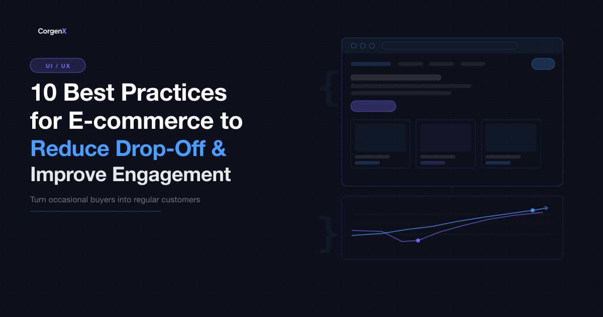
10 Ecommerce Best Practices to Reduce Drop-Off and Improve Retention (2026)
The average ecommerce store loses 70 out of every 100 potential buyers before they complete a purchase. Cart abandonment alone averages 70.19% globally (Baymard Institute) — meaning the majority of people who add items to their cart leave without buying. On mobile, the number is higher, with abandonment rates exceeding 85% on many categories. And cart abandonment is only one part of the problem: 40–60% of visitors bounce after viewing just one page, and most first-time buyers never return without a deliberate retention effort.
These numbers are not fixed. The majority of ecommerce drop-off is not caused by pricing or product quality — it is caused by friction, uncertainty, and forgettability. Unexpected fees, complex checkout flows, unclear return policies, and a lack of post-purchase re-engagement are all problems that can be fixed without increasing your ad budget. The ten best practices below target each of those causes directly, with the specific problem each one solves and the actionable fix that addresses it.
 10 Ecommerce Best Practices to Reduce Drop-Off and Improve Customer Retention
1. Optimise Your Checkout Flow
Problem it solves: Complex, multi-step checkout processes are the single largest recoverable cause of cart abandonment. Every extra field, page, or unexpected friction point increases the probability of losing the sale — often right at the moment of highest purchase intent.
Actionable fix:
- Allow guest checkout — mandatory account creation before purchase is a significant conversion killer
- Condense to the minimum required fields: delivery name, address, and payment method
- Enable address autofill via location APIs to reduce typing effort
- Display a progress indicator ("Step 2 of 3") to reduce uncertainty about how long checkout takes
- Reveal all costs — shipping, taxes, handling — on the cart page before the first checkout step. Surprise fees at the final step are among the top cited reasons for abandonment.
- Offer multiple payment methods: card, UPI, digital wallets, and buy-now-pay-later for larger orders
A checkout that can be completed in under two minutes with all costs shown upfront can meaningfully lift completed purchase rate — Baymard Institute research suggests that fixing the most common checkout usability issues alone can recover a significant share of otherwise-lost transactions.
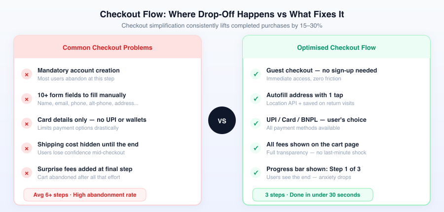 Every extra step, hidden fee, or forced sign-up is a point where users leave. Optimised checkout removes all of them.
2. Send Cart Abandonment Emails
Problem it solves: Most visitors who add to cart and leave are not permanently gone — they got distracted, hit an unexpected fee, or want to think it over. Without a re-engagement sequence, that purchase intent disappears within hours.
Actionable fix: Send a three-email cart recovery sequence with decreasing urgency:
- Email 1 — 1 hour after abandonment: A soft reminder showing the product image with a direct link back to the cart. No discount yet. This catches the largest share of abandoners who were simply interrupted.
- Email 2 — 24 hours: A personalised follow-up that addresses common hesitations — include your return policy, delivery timeframe, and a "we're here if you have questions" message. Answers the trust concerns that blocked the first purchase.
- Email 3 — 72 hours: A final nudge with a time-limited discount or free shipping offer if margin allows. Creates urgency without the aggressive tone of a repeated identical email.
Cart abandonment sequences consistently recover 5–15% of otherwise-lost carts — a meaningful revenue stream that requires no additional ad spend and scales automatically.
3. Improve Your Product Pages
Problem it solves: Users abandon product pages when they still have unanswered pre-purchase questions. Uncertainty about sizing, materials, delivery, or returns stops buyers at the final consideration stage — after you have already paid to bring them to the page.
Actionable fix:
- Write product descriptions in use-case language, not spec language: "designed for all-day comfort during commutes" lands differently than "lightweight, ergonomic construction"
- Include exact dimensions, materials, compatibility notes, and care instructions for every product
- Add a size guide with model reference measurements (model height, size worn) for fashion and footwear
- Display delivery timeframes and return policy directly on the product page — not buried in the footer or a separate policy page
- Show customer photos alongside brand photography. Real-world images build trust that styled product shots cannot replicate.
- Add a short FAQ section below the main description covering the most common pre-purchase questions (sizing, material, care, shipping timeline)
Product pages that answer every pre-purchase question do not just improve conversion — they reduce return rates and customer service volume at the same time.
4. Fix Mobile UX
Problem it solves: More than 70% of ecommerce traffic comes from mobile devices, but mobile checkout abandonment significantly exceeds desktop abandonment. Most ecommerce sites are still designed desktop-first and scaled down for mobile, and the experience shows in the drop-off data.
Actionable fix:
- Keep primary actions (Add to Cart, Buy Now, navigation) within thumb reach on small screens
- Use sticky "Add to Cart" buttons that remain visible as the user scrolls through product images and description
- Remove or minimise popups that block content on mobile screens — they are more disruptive on mobile than on desktop and trigger abandonment
- Ensure all tap targets (buttons, links, form fields) meet the minimum 44×44px size for accurate mobile tapping
- Simplify mobile checkout to the minimum possible number of taps to complete a purchase
- Test the full checkout flow on a real mobile device, not just a browser simulator — simulator testing misses real-world scroll, tap, and keyboard behaviour
Mobile UX improvements compound with each iteration: every reduction in tap friction, layout shift, or checkout complexity reduces drop-off not just at the point of purchase, but across every return visit.
5. Improve Page Speed
Problem it solves: A one-second delay in page load time reduces ecommerce conversions by approximately 7% (Akamai research). On mobile connections, slow-loading product pages and checkout steps cause users to abandon before the content they came for has even appeared.
Actionable fix:
- Compress all product images and serve them in next-gen formats (WebP or AVIF). Uncompressed images are the most common page speed killer on ecommerce sites.
- Use a CDN (Content Delivery Network) to serve assets from servers geographically close to your customers
- Lazy-load images that are below the fold so the visible product renders immediately
- Audit and remove unnecessary third-party scripts — analytics tags, live chat widgets, review plugins, and marketing pixels each add load time. Remove any that are not actively generating value.
- Target a Largest Contentful Paint (LCP) under 2.5 seconds and a Cumulative Layout Shift (CLS) below 0.1, measured via Google's Core Web Vitals
- Run your highest-traffic product page and your checkout URL through Google PageSpeed Insights and action the three highest-priority recommendations first
Page speed affects both conversion rate and search ranking simultaneously. Fixing Core Web Vitals on an ecommerce site typically improves both metrics.
6. Add Trust Signals Across Key Pages
Problem it solves: A user who does not trust your store will not buy from it — regardless of product quality or competitive pricing. Trust is not established once at the homepage; it needs to be reinforced at every decision point in the purchase journey, especially on product pages and at checkout.
Actionable fix:
- Display customer review scores and total review count prominently on product pages — immediately below the product title, before the description
- Show security and payment logos at checkout: SSL certificate indicator, Visa/Mastercard/UPI logos, and any trust badges relevant to your market
- Make your return and refund policy visible before purchase — link to it on the product page and in the checkout flow, not only in the footer
- Display delivery expectations early: "Order by 6 PM — delivered tomorrow" or "Free returns within 30 days" placed near the Add to Cart button answers hesitations before they form
- For higher-value orders, include a visible contact option (email, phone, or chat) on the product page so buyers know a real business stands behind the transaction
Trust signals are most effective when they appear at the exact moment of hesitation — near the price, on the checkout page, and alongside the shipping cost reveal.
7. Use Upsells and Cross-Sells
Problem it solves: Most ecommerce stores leave average order value (AOV) on the table by presenting products in isolation. A buyer who has decided to purchase is in the highest-trust state they will be in — most stores make no attempt to increase the value of that transaction before it closes.
Actionable fix:
- Show "Frequently Bought Together" product sets on product pages and in the cart, based on actual purchase co-occurrence data rather than category similarity
- Add complementary product recommendations during checkout: "Add a protective case for ₹499" when buying a phone makes the suggestion relevant and low-effort to accept
- Upsell to a higher-tier version of the same product before checkout: "Upgrade to the 2-year warranty for ₹299" gives the buyer a value decision, not a cold pitch
- Set a free shipping threshold slightly above your current average order value ("Add ₹200 more for free shipping"). This single tactic reliably increases AOV because the motivation is immediate and the benefit is clear.
- Use post-purchase upsells on the order confirmation page: after the transaction is complete, recommend a related product the buyer has not yet purchased — it is the highest-trust moment available
Well-implemented upsell and cross-sell placements consistently increase AOV by 10–30% without changing your traffic or base conversion rate.
8. Make Your Return Policy Impossible to Miss
Problem it solves: Return policy uncertainty is a significant and often invisible cause of purchase hesitation. Buyers who cannot find the return policy before committing — especially for higher-risk categories like fashion, electronics, or furniture — simply do not buy. The policy is there; it is just not where the hesitation happens.
Actionable fix:
- Display the return window and core terms directly on every product page, near the Add to Cart button: "Free returns within 30 days" answers the hesitation before it forms
- Write the policy in plain language, not legal language. "Changed your mind? Return it within 30 days for a full refund, no questions asked" outperforms a link to a 500-word policy document for conversion purposes
- Include return policy information in cart abandonment emails — this is a commonly unspoken hesitation that most abandonment sequences never address
- For categories with naturally higher return rates (fashion, footwear), make the returns process itself a feature: "Returns are free and take 60 seconds to initiate in your account" removes the fear of being locked in
A clearly visible, easy-to-understand return policy reduces cart abandonment and increases first-time buyer conversion. The trust signal it provides is worth more than the marginal cost of a slightly higher return rate.
9. Add Live Chat at Key Drop-Off Points
Problem it solves: Buyers who have a question during browsing or checkout either get an answer or they leave. Most ecommerce sites offer no way to get a quick answer during the purchase process — so uncertain buyers take the path of least resistance and exit.
Actionable fix:
- Deploy live chat specifically on product pages and checkout pages — not just your homepage or contact page, which buyers have often already bypassed
- Set proactive triggers: if a user has been on the checkout page for more than 60 seconds without progressing, trigger a message: "Need help completing your order?"
- For teams without the capacity for live staffed chat: train a chatbot to handle the five most common pre-purchase questions (delivery time, return policy, sizing, payment options, stock availability). A reliable chatbot that answers these consistently is more useful than live chat that is rarely staffed.
- Display your chat availability hours clearly — "Live chat: Mon–Sat, 9am–7pm IST" manages expectations and prevents frustration when response times are slow
Live chat on checkout pages specifically reduces abandonment because it converts "I'm not sure about this" into "I got my question answered and completed the purchase."
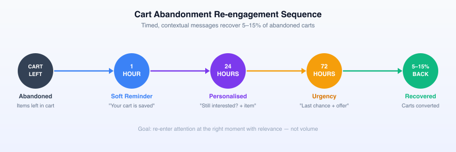 Timed re-engagement — soft nudge, personalised follow-up, final incentive — recovers 5–15% of carts that would otherwise be permanently lost.
10. Build a Loyalty Programme
Problem it solves: Most ecommerce stores are structurally better at acquiring new buyers than retaining existing ones — despite the fact that retaining a customer costs 5–7 times less than acquiring a new one. Without a structured retention incentive, most first-time buyers make one purchase and do not return.
Actionable fix:
- Implement a points-based loyalty programme that rewards every purchase — not just large ones. Small, consistent rewards shift purchase behaviour structurally over time.
- Offer member-exclusive benefits that feel genuinely valuable: reduced free-shipping thresholds, early access to new products, priority customer support
- Give a points bonus on the first purchase specifically — the hardest conversion in retention is getting a one-time buyer to return. Starting the loyalty progression immediately increases the probability of a second purchase.
- Personalise loyalty communications based on individual history: "You're 200 points from free shipping" is more motivating than a generic "earn points on every order"
- Use email and push notifications to alert members when they are approaching a reward threshold — the "almost there" notification is one of the highest-engagement triggers in ecommerce retention
Loyalty programme members typically spend 12–18% more per order and purchase significantly more frequently than non-members. The programme pays for itself across the lifetime value difference between returning buyers and one-time buyers.
Retention vs Acquisition: Why Keeping Customers Is Cheaper Than Finding New Ones
Ecommerce growth strategy is almost always framed around acquisition — more ads, more traffic, more new customers. But the economics of retention tell a different story.
Acquiring a new ecommerce customer costs, on average, 5–7 times more than retaining an existing one. New customers require ad spend to reach, landing pages to convert, and a complete trust-building cycle from scratch. An existing customer already trusts the brand, knows the checkout process, and is far more likely to convert from an email or loyalty notification than from a cold ad.
The retention economics compound over time:
| Metric | New Customer | Returning Customer |
|---|---|---|
| Acquisition cost | High — paid ads, SEO, campaigns | Low — email, push, loyalty |
| Repeat purchase probability | 1–3% on average | 60–70% for existing customers* |
| Average order value | Baseline | 12–18% higher |
| Support cost | Higher — unfamiliar with the process | Lower — experienced buyer |
| Referral likelihood | Low | Significantly higher |
*Source: Marketing Metrics (Farris et al.) — represents the probability that an existing customer makes at least one more purchase, not the conversion rate of an individual email or notification.
A 5% increase in customer retention can increase profitability by 25–95% (Bain & Company). That figure is not primarily the result of loyalty discounts — it is the compounding effect of a customer who buys more often, costs less to serve, is more likely to refer others, and is less sensitive to competitor pricing because they already trust the brand.
The ten best practices in this guide primarily improve conversion at the first purchase — but they simultaneously set up the conditions for retention. A buyer who experienced a frictionless checkout, received timely cart recovery communication, found the return policy clearly stated, and earned loyalty points on their first order is not a one-time buyer. They are the beginning of a retention curve that grows revenue without growing ad spend.
FAQs
What is the most common reason ecommerce visitors drop off before buying?
Cart abandonment is the largest measurable drop-off point, averaging 70% globally. The most frequent causes are unexpected shipping costs or fees revealed late in checkout, mandatory account creation before purchase, slow page loading on mobile, and uncertainty about return policies. The highest-impact quick fixes — revealing all costs on the cart page, enabling guest checkout, and displaying the return policy on product pages — address the causes behind the majority of recoverable abandonment.
How do cart abandonment emails work and are they worth setting up?
Cart abandonment emails are automated messages sent to users who added items to their cart but did not complete the purchase. They work because most abandoners are not permanently gone — they were interrupted, hesitant about shipping costs, or simply not ready. A well-timed three-email sequence (1 hour, 24 hours, 72 hours) with relevant content and a final incentive recovers 5–15% of otherwise-lost carts. For any store with an email list and cart data available, this is one of the highest-ROI retention automations to set up first.
How important is page speed for ecommerce conversion?
Very important. Research from Akamai found that a one-second delay in load time reduces ecommerce conversions by approximately 7%. For mobile users on slower connections, the impact is more pronounced — a checkout page that takes four seconds to load loses a meaningful share of buyers before the form even appears. Page speed also directly affects Google search rankings through Core Web Vitals, meaning slow pages lose both traffic and conversion simultaneously. Compressing product images, reducing third-party scripts, and using a CDN are the three fastest improvements.
What makes a loyalty programme actually drive repeat purchases?
Programmes that drive retention reward every purchase rather than just large ones, communicate progress visibly ("You're 150 points from free shipping"), and offer benefits that feel genuinely exclusive. The psychological mechanism is the endowed progress effect — when users feel they are partway toward a goal they have already started, they are significantly more motivated to complete it. Giving bonus points on the first purchase starts this progression immediately and meaningfully increases the probability of a second purchase, which is the most important conversion in the retention journey.
Should I prioritise retention or acquisition for ecommerce growth?
Most ecommerce businesses should shift more budget toward retention earlier than they do. The general rule: if fewer than 30% of first-time buyers make a second purchase, fixing retention is more efficient than scaling acquisition. Every improvement to post-purchase experience, loyalty mechanics, and return buyer rate compounds — a 5% improvement in retention has a larger impact on total revenue than a 5% improvement in new customer acquisition cost, because it affects the full lifetime value of every customer you have already paid to acquire.
Related Articles
Ready to Scale?
Our high-performance web solutions and SEO strategies are designed to deliver results.
Check out our services